Each year, Sherwin-Williams curates its annual Colormix® Forecast for different industry segments, from new residential, to multi-family, commercial and education. This year’s 2021 selections for the multi-family market consist of four palettes: Encounter, Continuum, Tapestry and Sanctuary, designed to help property managers create a functional and appealing space in their communities. Here are tips for how professionals can incorporate the forecast's Sanctuary and Tapestry palettes into their properties.
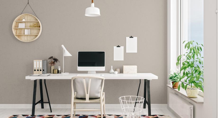
There are many features that residents consider when selecting an apartment community, including the location, price and even the amenities it offers, from a fitness center to a landscape pool. Another important feature that can make an entire building distinct—both outdoors and indoors—is the property's color palette.
Paint and coatings manufacturer Sherwin-Williams has mastered this lesson. For more than 155 years, the company has specialized in the development of innovate coatings and color expertise. With over 1,700 colors and a wide selection of products, Sherwin-Williams can help property managers with color and product recommendations that help properties stand out from the competition.
Through extensive research on home furnishings, hospitality, fashion, science and travel, the company’s color marketing and design team curates its annual Colormix® Forecast, which reflects changes in annual trends.
This year’s forecast of 40 colors was translated into four tailored palettes: Sanctuary, Tapestry, Continuum and Encounter—each conveying a unique sensibility and feel. How colors within the palettes are paired can help to make a space look bigger, more intimate, bolder, more modern, softer or more alive. The possibilities are infinite.
For example, a rich green such as Oakmoss SW 6180, part of the Sanctuary palette, can be used as an accent wall in a lobby. This color immediately connotes a warm welcome home by mimicking nature. Embellished Blue SW 6749, from the Tapestry palette, could be painted on the ceiling of a common room to inspire a calm and inviting feeling.
Here are more ideas about how the Sanctuary and Tapestry palettes can be used to appeal to residents:
Sanctuary
This palette draws from the past and the principles of biophilia, which involves bringing nature inside as a way to inspire mental and physical well-being.
“That’s what most of us need at a time when we have turned to our homes as our sanctuary,” says Katie Martin, interior designer and color marketing expert at Sherwin-Williams. "The Sanctuary palette also offers an optimistic spark that will help transform any space. For example, Sherwin-Williams 2021 Color of the Year, Urbane Bronze SW 7048, represents a shift to warmer neutrals, stepping away from cool neutrals such as gray."
The palette incorporates muted greens and browns, along with beige and gray but in versions such as Bona Fide Beige SW 6065 and Pearl Gray SW 0052. Aligned with fresh colors like Canyon Clay SW 6054 or Morris Room Grey SW 0037, the combinations used on an exterior beckon residents home or inside and can help them slow down.
Tapestry
This palette uses color in feel-good ways as we tap into environments that make us feel our best. The palette inspires imagination for creative expression through our environment.
Tapestry includes a range of lively hues, from Jovial SW 6611, an optimistic pink, to deeper Jaipur Pink SW 6577, a bold green such as Cape Verde SW 6482, and Perfect Periwinkle SW 9065. All these hues segue to a much-needed dose of cheer, especially in a small space or on an accent wall, Martin says. For a softer, more pastel contrast for a larger area, the collection includes colors like Greek Villa SW 7551 and Enjoyable Yellow SW 6666, which can inspire future travel to a sunny destination and a joyful feeling in residents.
Sidebar/Box: Tips from color expert Katie Martin
- Vary colors in connecting common areas, noting how each works well together with a common thread— the same color family, same degree of saturation or same trim color.
- Repeat paint colors in furnishings and accessories. For example, if using bronze and charcoal hues, combine these with metal tones in furniture, lighting and hardware.
- Novel hues add freshness and professionals should balance these choices with timeless neutrals.
- Pick a sheen according to the space and its use. For example, a satin finish works best for high-trafficked areas.