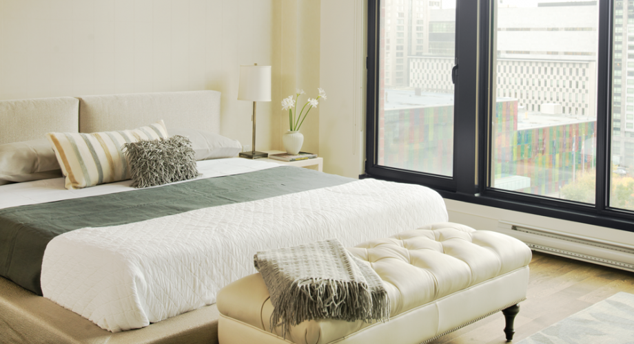
Home interiors today should help to release stress by staying silent, uncluttered and light.
It can be kind of amazing how many different shades of off-white exist. And while that might greatly appeal to those who love vanilla ice cream, apartment decorators are finding appealing tones and clever ways to use them in apartment models.
Painted accent walls are among several outdated interior design trends, according to a survey of 50 designers done this summer by The Wall Street Journal.
Nina Magon, of Houston’s Contour Interior Design, notes that accent walls—a strategy originally hyped as high-impact, low-cost—don’t fool anyone.
“It gives the impression the [allocated] budget could not complete the design intent and looks unfinished,” she says. New York designer Richard Rabel added that you can get the same vaunted pop-of-color effect with “rugs, pillows, window treatments and art.”
Using wallpaper printed with an overly large pattern such as botanical plants on one interior wall is becoming fashionable, Dee Schlotter, Sr. Marketing Manager, Color, PPG, says. “Seeing some accent walls incorporating wood, and sometimes stone or brick, can work as well as interior doors being painted in stand-out colors to become a focal point in the room is a nice accent without it having to involve an entire wall.”
Schlotter says ceilings are opportunities to have attractive accent walls– if you have a nice lighting fixture to highlight it.
Jacqui McCowan, Interior Designer for Sherwin-Williams, says she can see why some designers might say that accent walls are going out of style.
“In general, we are seeing more color throughout an entire room as opposed to one wall,” McCowan says. “When it comes to apartments, however, offering one accent wall is still more practical. It’s easy to maintain as renters come and go and it makes sense financially.
“This newer resident demographic lives in a world where everything is customizable. They appreciate color and want their home to feel personalized. Accent or feature walls do just that.”
Schlotter says trim can also go dark versus the traditional whites.
“Beautiful, wide, gorgeous trim can look great in black and dark gray with white walls,” she says. “Furniture, cabinets and islands painted in noticeable colors—and not color-matched—is trendy. Use fun paint colors instead of wood stain.”
She says interest has been growing in metallics because they make a room look high-end and are often used in hospitality.
Behr Paint named “Back to Nature” its 2020 Color of the Year. It is described as a restorative, meadow-inspired green, which captures the emotion of wilderness landscapes and indoor gardens while being subtle enough to serve as a new neutral.
“Just as plants release oxygen into the air, incorporating this ecological green in your home helps purify and promote a balanced space—bringing the outside, inside,” says Erika Woelfel, Vice President of Color and Creative Services at Behr. “Back To Nature encourages us to reengage with the natural world, which we know can have a real, positive impact on our well-being. Everyone has a different way of engaging with nature. Whether you’re biking on a forest path, canoeing on a lake or walking on the beach, green is prevalent in nearly every outdoor landscape—it is easily nature’s favorite color.”
Other passé efforts include kitchen walls painted in the “golden tones of aged Tuscan-villa walls,” according to WSJ. “They add a heaviness to a room and really devalue a space,” says one designer.
The survey also recommends sanding intentionally textured walls. The Tuscan look—and faux finishes in general—seem to be out of favor, Schlotter says. “They absolutely do add heaviness and congestion to a room,” she says. “They represent the exact opposite feeling that we see customers wanting today, given all the distractions that they face all day, every day. They want silence, space, uncluttered and lightness. Home interiors should serve as a release from stress, and those layered or heavy faux finishes don’t give you that.”
Mid-range, yellow-toned oak cabinets, Jacuzzi tubs and overdyed antique slash vintage rugs also were panned in the recent survey.
Is Pink the ‘It’ Color for Millennials?
Color trend experts are beginning to call pink as the Millennials’ “it” color.
It has come to represent an androgynous neutral, some contend, for a generation that is open to gender fluidity. Besides pink, an entire palette of murky pastels, from a mellow mustard yellow to moody-minty green, has followed suit.
“Millennials have embraced power pastels because they bring people together rather than cause divisions,” says one designer, reports The Wall Street Journal (WSJ). “Pinks are no longer feminine. Blues aren’t masculine.”
One Millennial disagrees, “I can’t see the average Millennial man (especially straight ones) wanting to have anything in his apartment be any shade of pink.”
These pastels’ versatility works well with woods— from pale ash to rich walnut—and complement metals such as rose gold and silver, “making them easier to commit to than a bright red dining-room table,” one says. “These are colors that are easy to live with.”
Says one Millennial, “Dull pastels are ‘in,’ for model apartments; sticking to natural wood, metals, and a lot of white with a few darker accent colors is good.”
Another says these “unsweet pastels” fit GenY’s obsession with clean, understated Scandinavian style. Pastels bring a sense of calm. “These colors are optimistic yet gentle, making them great to both fall asleep and wake up to,” one says.
“Minimalism and a clean, uncluttered look are nearly universally valued by Millennials,” another says. “The group’s general valuation of experiences over things is reflected in a desire for clean, simple, elegant living spaces, preferably with lots of natural light.”
